CalMatters Data Infrastructure & Dashboards
Designed and operated a data structure that guided efforts to build an audience and analyzed the success of product initiatives.

When I joined CalMatters, the newsroom had one, multi-page dashboard that was no longer maintained. It contained dozens of metrics without clear connections to business goals, and only a few individuals (mainly leadership and top editors) used it. My task was to bring together data from a variety of sources — referral traffic metrics, social media insights, newsletter subscription growth — into interactive dashboards that aligned with actual business objectives. CalMatters also needed a data democratization strategy that made data and goals more accessible across the organization.
Challenge
CalMatters faced several challenges:
- Siloed data architecture: Multiple disconnected systems prevented a unified view of audience behavior across platforms
- Editorial decisions without data accessibility: Reporters and editors lacked visibility into content performance, audience preferences and article-level metrics such as engaged time or referrer breakdown
- Data without insights: The existing dashboard captured a lot of metrics but they weren't supported with any clear takeaways or context for improvement
Technologies Used
- Figma
- Looker Studio
- Google Apps Script
- Mailchimp API
- WordPress RSS
- Supermetrics
- Google Sheets
Approach
My approach to this project centered on first understanding user needs. I interviewed key stakeholders across the organization, including reporters, editors, audience engagement staff, development and senior leadership, to understand what questions they had that data could help answer.
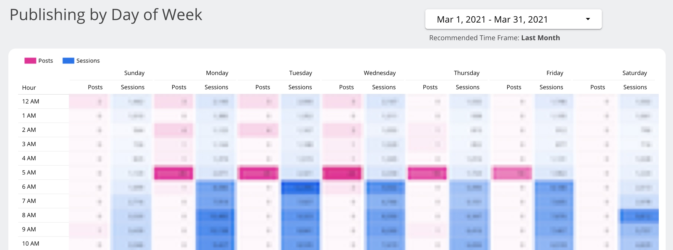
These conversations revealed that different teams needed different insights. For instance, editors wanted to know optimal publishing times for stories, reporters were curious about where traffic to their stories came from, our social media manager wanted to understand engagement across social platforms, and leadership needed to know how our loyal audience behaved.
I used the stakeholder interviews to define metrics and KPIs, and then I mapped them against the available data sources to determine if I could retrieve the data.
Most of what we needed was available in Google Analytics (GA4). Collecting WordPress publishing and Mailchimp newsletter data required writing Google Apps Script code. I partnered with our web developer to connect to the WordPress RSS feed and MailChimp API, pulling the data into Google Sheets. The scripts were set up to run automatically and append the spreadsheets with new data while preserving historical information.
Supermetrics, a web-based ETL tool, was another key enabler, allowing me to quickly and easily extract data from various sources — social media platforms in particular — and transfer it to Google Sheets.
When determining what to visualize, I considered the data type, what I was trying to communicate, and the audience for the visualization. For example, when editors requested optimal publishing insights, I used a pivot table with a heat map to show traffic patterns by time and day of the week, making peak engagement hours immediately visible.
I chose bar charts for comparing categories or values between groups, line charts for showing trends over time and stacked bar charts to visualize the composition of a whole when comparing categories (such as top traffic referrers).
I created wireframes and prototypes of each dashboard using Figma, defined the color palette based on best practices, ran user tests on the prototypes, incorporated feedback, and iterated on the designs. Then came the actual build of the dashboards in Looker Studio, connecting all of the data sources, setting up the metrics and visualizations, creating a glossary of terms, and final user testing.
Training, Documentation & Feedback
After deploying the dashboards, I led a comprehensive training session, wrote documentation and user guides, conducted ongoing maintenance and solicited user feedback post-launch.
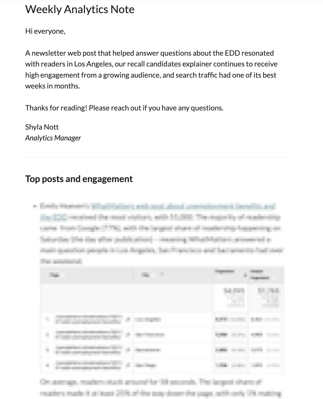
I used the dashboards to distribute an organization-wide weekly analytics report that identified wins and opportunities for improvement while providing greater historical context.
Results
The dashboards empowered editorial, membership and engagement teams to make faster, data-informed decisions. They also acted as a jumping off point for deeper analysis. For example, our managing editor came to me to understand the performance of question headlines compared to non-question headlines. My analysis found that headlines written in the form of a question received 20% less traffic on average.
By democratizing the data into intuitive dashboards made accessible to everyone, insights were no longer siloed to a select few, instead allowing for content optimization and product decisions to occur across the organization.